Lisbon, Portugal
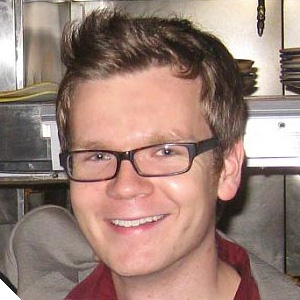
Andrew dabbles in being his own coding and visual design wingman on the side. He's currently working on a web app that uses the cooler features of HTML5 to make knowing when and where to catch the bus as easy as waking up your phone. On paper, Andrew went to college for Digital Media Design at UPenn; in life, he can be plied with a slinky, a crossword, and a rousing discussion about philosophy.

We make new things look like old things because the old is familiar: it helps with usability, it makes us safer, and it's cute. Our mobile phones have replaced pads of paper and physical dials with touchscreens that have pictures of these things on them. Our digital cameras play a prerecorded shutter sound when we press the button because that's how our old cameras told us the picture was taken.
Their ability to both delight and confuse is profound - skeuomorphic touches will invariably get oohs and aahs at design reviews and from users. Yet in the quest for familiarity and nostalgia, these flourishes can perpetuate interfaces that only made sense given past technical limitations or, worse, suggest vintage mental models that are out of sync with the product's modern features.
Come listen to a light-hearted discussion about the what and the why of this increasingly common design pattern and how designers can leverage everything that's cute and rich about skeuomorphs without compromising mental models or a polished product.